Ajay Kelkar - Telling Stories with Data
Mo Data stashed this in Data Strategy
Most people see Analytics as a technical & specialist role. Ajay Kelkar see Analytics as an intersection between technology & business. In this session at The Fifth Elephant, Ajay tells stories from data that he has seen over the last decade. Stories about how data has made a difference to a business & how you can go about doing the same.The Fifth Elephant 2012 is a conference on the big data ecosystem by HasGeek
http://blog.hansacequity.com/Customer-Management-blog/?Tag=storytellers
Analytics and data are transforming companies around the world. Yet one of the great difficulties with analytics is that it can be difficult to explain and understand; it is widely held that analytics specialists don’t communicate well with decision makers, and vice-versa.
As a result, analytics adoption is still not easy within companies. Analysts, at one end, are busy learning more specialised & deeply technical methods of analysing data & at the same time they are finding it difficult to get theses stories “heard” within organisations. Influencing ultimate decision makers is similar to selling products or services to external customers. Analysts need to understand that when they present ideas to decision makers, it is their responsibility to sell – not the decision maker’s responsibility to buy
Stories are the best way to influence! But we don’t see them being used so often. Analytics doesn’t need you to solve only a technical problem but a “social” one. Analytics is sexy but for it to make an impact, it needs to be embedded into the fabric of the company. This calls for analysts to become more social & in fact better presenters & story tellers. They need to learn to demystify analytics & link it to practical ways for the business to make money! And analysts need to learn to link their work to “the last mile”. Analytics should not be expected to deliver a “Aha moment”, instead it should be a “factory approach to improved decisions”. So analytics is not just a planning tool as much as it is an Execution tool to improve the customer experience & business impact. Start with a decision in mind & work backwards, not with the data in mind & working forward
Compare the analytics industry with the world of journalism. One of the most deadline filled industries in the world is getting it right with what it calls precision journalism! Despite crazy deadlines, I am amazed at the powerful stories journalists write using data. I wish the analytics industry was half way as good!!
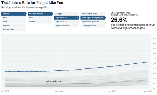
Here is an example from the New York times:

I can relate to the data above by filtering it to my exact demographic. Suddenly a dry topic like Jobless rates for the economy as a whole, becomes far more real & human to me.The corporate world needs to learn from this & use data to tell stories better! Journalists are coping with the rising information flood by borrowing data visualization techniques from computer scientists, researchers and artists. Some newsrooms are already beginning to retool their staffs and systems to prepare for a future in which data becomes a medium
Analysts are often tempted to communicate how they did the analysis: “First we removed the outliers from the data, then we did a logarithmic transformation; that created high autocorrelation, so we created a one-year lag variable”—& the typical business user is already yawning! The audiences for analytical results don’t really care what process you followed; they only care about results and implications
Here is an example of a master storyteller. Hans Rosling, a Swedish professor, popularized this approach with his frequently viewed TED Talk that used visual analytics to show the changing population health relationships between developed and developing nations over time. Rosling has created a website called Gapminder (www.gapminder.org) that displays many of these types of interactive visual analytics
In early 2010, The New York Times was given access to Netflix’s normally private records of what areas rent which movies the most often. The Times created an engaging interactive database that let users browse the top 100-ranked rentals in 12 US metro areas, broken down to the postal code level. A colour-graded “heatmap” overlaid on each community enabled users to quickly scan and see where a particular title was most popular.
Analytics needs journalists within their community to help make the data human!
Stashed in: Big Data!


9:35 AM Sep 18 2014